
The Making of a Book Cover, Part 2
And now . . . mocking up covers for the author to review.
In the process of creating a book cover design, this is the moment when all the previous steps in the process—reading and talking and sketching and iterating (and repeating those steps a few times)—pay off. Because here’s the thing: either we did our work and went as far as we could with ideating, or we didn’t.
If we did, there will be one cover mock-up that the author identifies with, that speaks to her, that speaks from the perspective of her book. And if we didn’t? It’s back to Part 1.
With Laura’s book, the cover design process was made both easier and more difficult—we had one illustration that was going to be used. More often than not, there are more images being considered for a cover, and each image, once chosen, asks for its own unique design—font, color, layout, etc. With Consecration Pond, creating the cover was all about looking for some varied ways to speak for the book, while using the same image each time.

Our first round mock-ups for the front cover got us here, and the first two pictured below went to Laura for review.
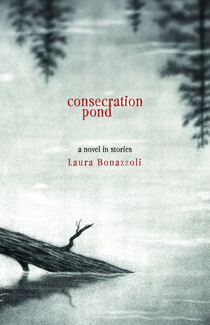

At first, Laura was all in on the first iteration (far left). But days later, when we all met up to go over the cover ideas, as well as talk about layout of the interior and what the back cover might look like, she’d had some second thoughts.
The red typeface? She suggested it might look like a true-crime cover to readers.
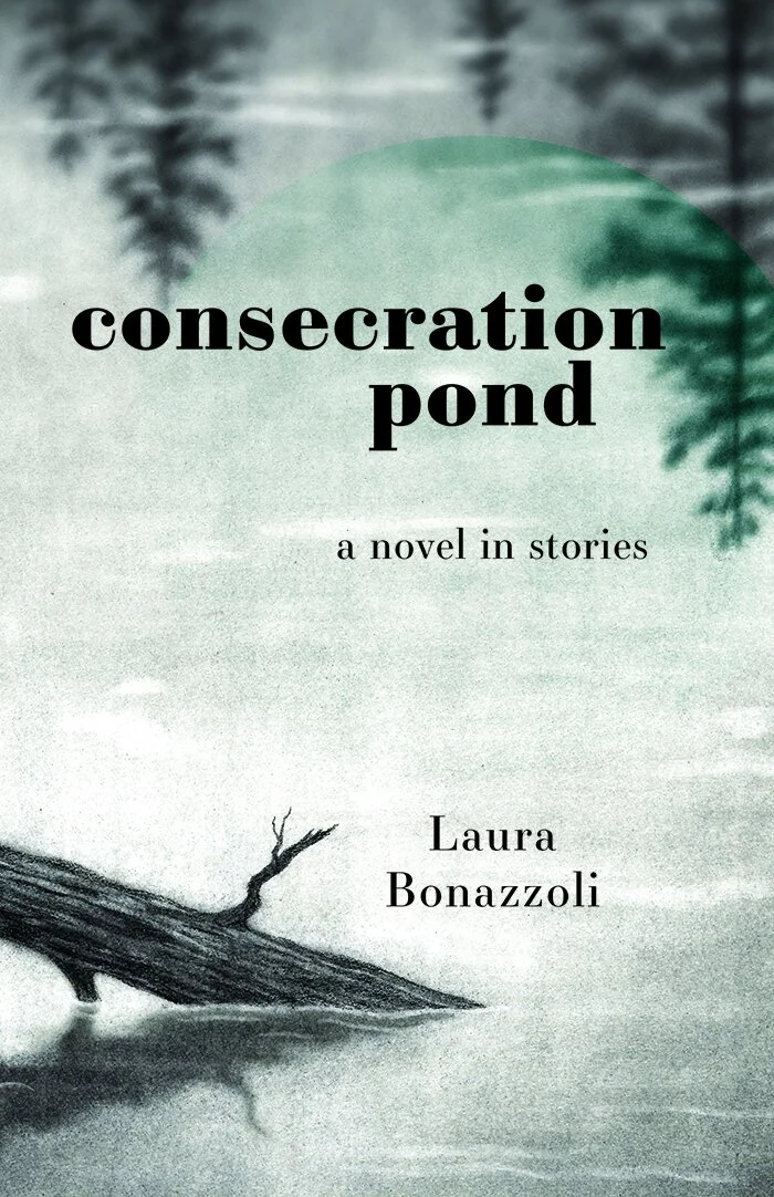
So we went back to make some adjustments. What we discovered, however, in creating a version with black or green type did nothing to elevate the cover; in fact, it looked flat—so flat that if it were sitting on a table in a bookstore, your eyes would probably have moved right past it, without even seeing it.
And so, we went back to the red, and did a re-approach with Laura—with this, there was space and time to explain the reasoning behind the design, to talk about the elements, the “whys” and the “why-nots.”
We began with a moody, mysterious black-and-white illustration (just what we wanted for this book) and now we needed to inhabit that illustration with the essence of the book. We thought the red sat beautifully on Elizabeth’s illustration, and that it was also representative of the story cycle Laura had created.
Red is symbolic of fire, vitality, life, energy, and warmth. It’s related to the heart, and yes, to blood, but blood isn’t always true-crime—it’s more often about movement and activity as it travels through our veins. Much like Laura’s stories.
Red is a color that at its core is pure contradiction—symbolizing love (and by extension, life) but also symbolizing war and death. It’s the strongest “yes and” color and it works ever-so-beautifully with these stories, the title, and with the illustration.
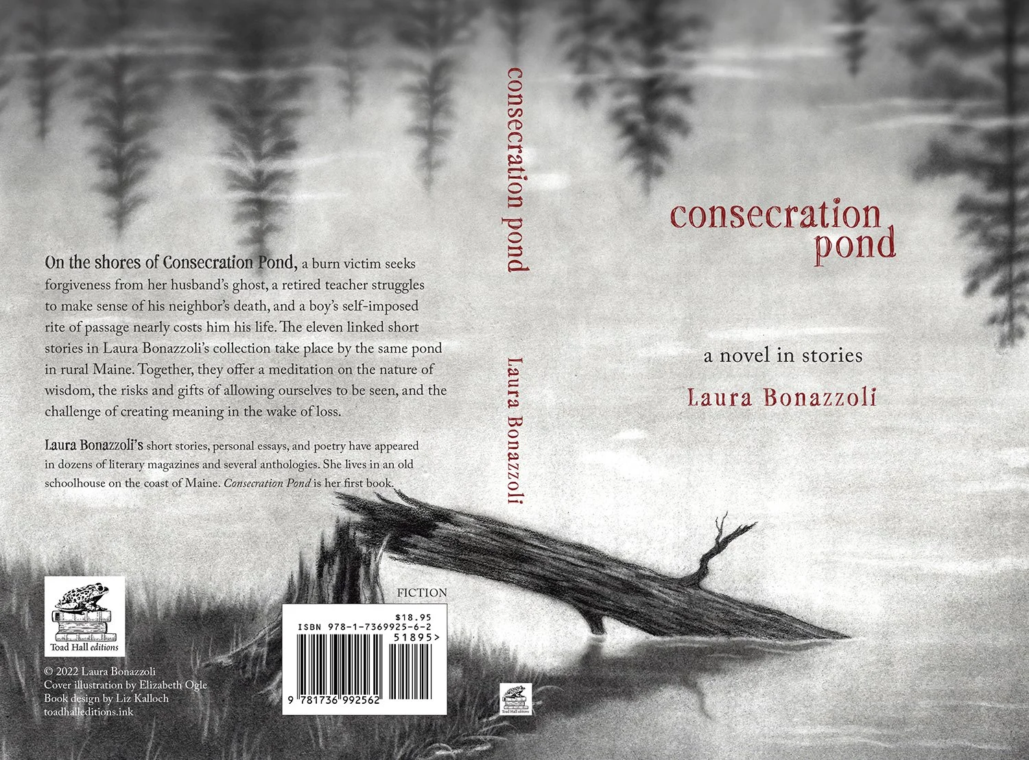
And so here’s where we landed. We kept the red, and we made some design adjustments that made the cover stronger—moving the word “pond” off to the right, slightly off-center, and yet just where it needed to be to give the reader a feel for what they’ll find inside the pages.
Look for more Making of . . . posts in the future!